Case Study: Google’s My Ad Center Button
An Accessibility Journey
By: Sierra Swann
Overview
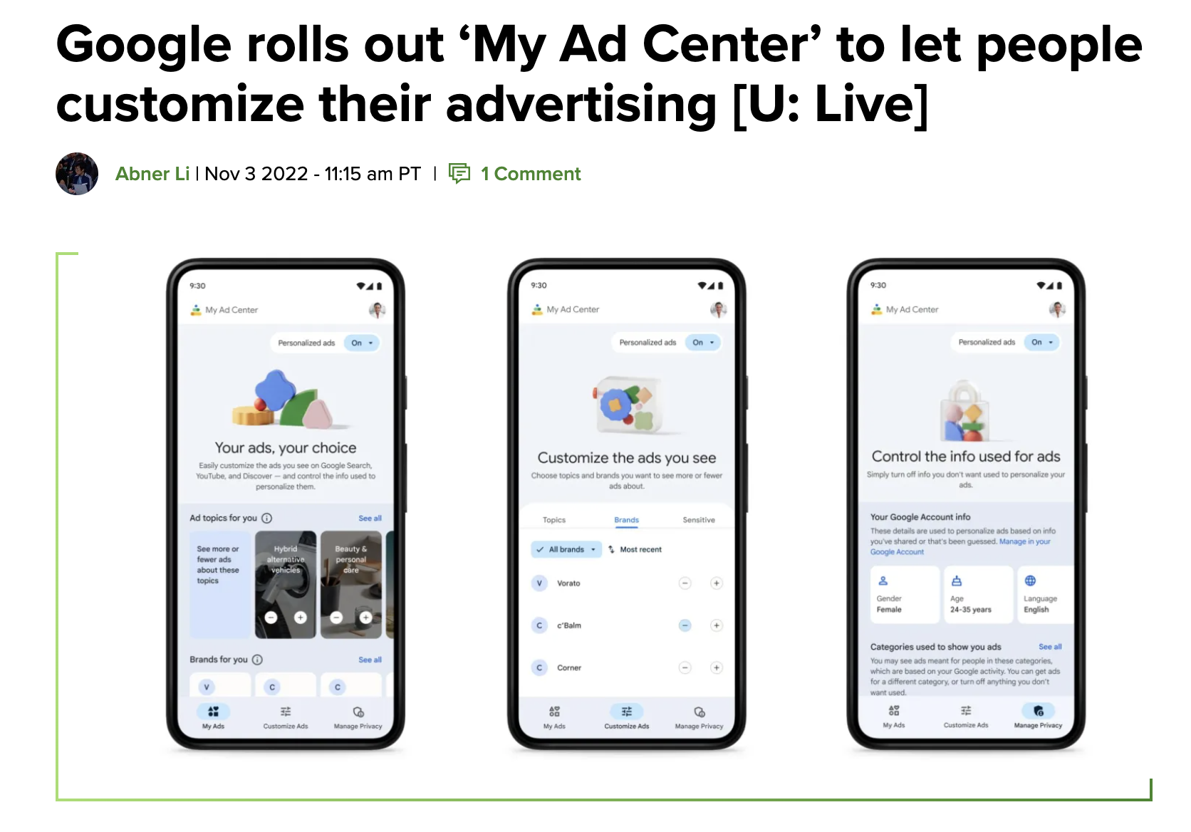
What is My Ad Center?
However…
Before launch, My Ad Center was not meeting accessibility standards.
Understanding the Problem
According to the CDC, 61 million adults in the United States live with a disability.
Users without disabilities experience three times higher usability than users who are blind or have low vision.
Source: The CDC
Diving into the Problems
Color: 01
According to our Google accessibility experts, users who are visually impaired, color blind, or have cognitive disabilities will face difficulty if the information is only conveyed through color/shape/visual location.
In our case, color should not be the only element to convey a selected state. A change in color and motion could be an appropriate fix.
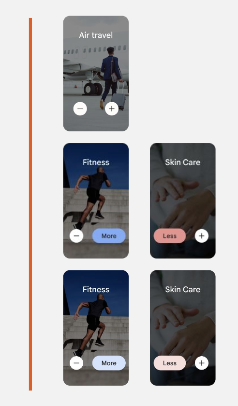
This is what the current controls look like.
User Feedback: 02
Our user research indicated that users found it hard to tell when a change occurred after they pressed a tuning button.
Implications:
Unfortunately, this led users to keep pressing buttons which distorted their trust and confidence in their ability to control their ad experience.
Reward: 03
Currently, the only indications in the UI that let a user know they’ve made a change are a snackbar and a button color change that pop up when an action is completed. The snackbar is not considered adequate sensory feedback.
We wanted to use color and motion to let users know they made a choice and that it was saved.
My Explorations
Exploration 1
Using color and text changes to highlight accessibility fix
To add clarity and reward
Deepened color change and played with expansion and compression of the button
“More” or “Less” would take the place of the icon when pressed
In Context
Exploration 2
Using color and animation to highlight accessibility change
This animation was too much for engineers to implement in a short time-frame
What would happen if users repeatedly pressed the “+” button?
What would happen if users pressed the “-” button?
Exploration 3
Using color, animation, and size changes to provide delight
Expansion and compression of card
The card has come to life
Would fulfill color and motion requirements
Final Decision
The team went with a background and stroke change
These are my learnings after doing user testing on the two designs


