MP•AR:
An alternate reality feature added to the Mountain Project app
Role: Researcher & Designer
Team: 2 UX Designers, 1 UI Designer
*conceptual project
Brief:
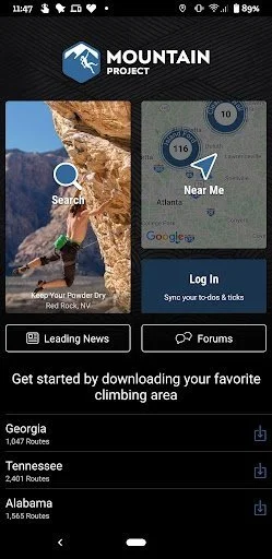
MP•AR is an app feature that my team and I added to an already existing mountain climbing app called Mountain Project
"Being prepared is the most comforting emotion that you can have…”
Users hailed the Mountain Project app as “The Bible of Climbing”. Because of this, we realized that a redesign nor a completely new app would be necessary. Instead, we brainstormed on how to improve the actual climbing experience for users. To narrow down our choices we sent out a survey to the public with the top 3 features we thought to add. AR won as the best solution to climbers’ problems.
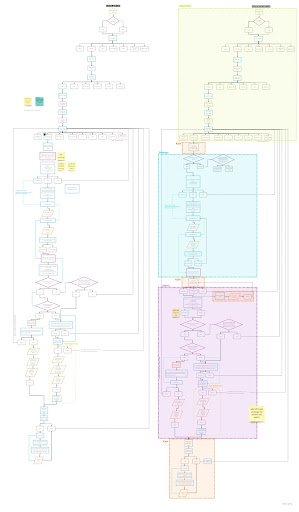
User Task Flow
Problem:
Avid Climbers consistently lamented the experience of not being able to find the route to climb while standing at the crag. They expressed the inconvenience of not knowing where certain bolts were while they were climbing which either made the route dangerous to climb, or impossible to finish.
Research
Our team conducted thorough research in order to gather a better understanding of features we could implement into MP. Our research included virtual interviews with climbers getting an idea of their tendencies when planning and climbing, a Competitor Analysis to identify and analyze opportunities within the market, and a Research Plan helping us outline our ideas.
Competitor Analysis
We analyzed 6 apps and through market research and user interviews, Mountain Project rose to the top of the pack as the app users used the most and found most useful.
That is why we chose it to be the product we added the new AR feature to.
Mountain Project’s Strengths:
- Do not need an account to see most content
- See ascent data from other users
- Share routes with others
- Lots of user generated content
- Webpage features "find a partner" page
User Interviews & Persona Building
We conducted 7 interviews. The interviews were conducted with climbers that had experience with either indoor or outdoor climbing. Here are some of their insights:
“Favorite feature [of Mountain Project] is the community aspect because there are a lot of people's experiences being shared.”
Definition & Synthesis
Our goal for the Augmented Reality Feature we added to Mountain Project was to stay on brand. We took the colors and icons that already existed on Mountain Project’s app and incorporated them into this new feature.
We were adamant about not doing a redesign and wanted to challenge ourselves by developing within and alongside the existing brand guidelines.
The Solution
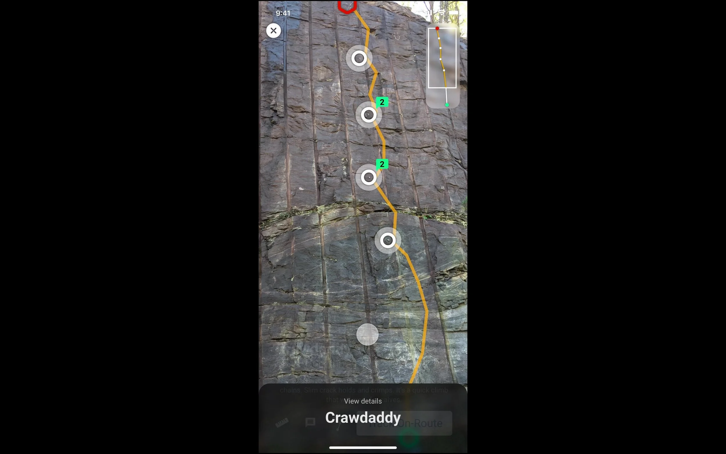
Our research inspired us to design an Augmented Reality feature that would help climbers identify their route and stay on track. This feature would be added to Mountain Project’s already existing list of features.
By analyzing our study results, we were able to come up with these main insights.
Affinity Diagram
Mountain Project’s Weaknesses:
-- App was not super easy to navigate
- Any "topos" have to be uploaded by user,
the app has no way to do that internally
- No video uploads supported
- Dated looking interface (for app)
Persona:
LEVI’S BIO
Levi is an avid outdoorsman who bagan his journey to climbing through hiking and backpacking. As a former Eagle Scout he already had some outdoors training. He got into climbing because his friends were into it, but stayed because he feels fulfilled when he has conquered a route he has been working on.
FRUSTRATIONS
Not all crags have guidebooks and they can be hard to find or expensive to invest in
Relying on cell service makes it hard to use online resources while at the crag
Clear directions from parking to the crag are typically limited or vague
Problem Statement
Avid rock climbers enjoy using Mountain Project for all the available features but wish there were
more robust directions, weather information, offline crag and route guidance, community engagement, and planning features.
Our Biggest Insight:
User Interaction Flow
Lo-Fi Wireframing & Testing
Sketches
Lo-Fi Prototype
Style Guide
Applying Feedback to Hi-Fi Design
Hi-Fi Prototype
Hi-Fi Testing Insights
Insights & Improvements
Quantitative Insights:
We tested a total of 9 users
6 out of 9 users chose to experience tracking through the phone simulation
8 out of 9 users were able to successfully get to the end of the tracking experience
Qualitative Insights:
User could see the new feature being very functional at a place where the guidebook is not helpful or does not exist”
Users came to the consensus that the AR feature was “cool” and that they would use it if it were intergrated into Mountain Project’s platform
“Before starting a climb I like to "map" out my route from the ground to solve the puzzle.”
Commenting sequence is “clunky”
More clearly demonstrate the capabilities of the commenting functionality
Touch points need to be larger to accommodate more users
Improve “tracking” sequence clarity, why would a user do this?
MP•AR Feature Walk-Through
I hope you enjoyed the walk-through. Please feel free to reach out to me with any questions you may have!
Future Opportunities
Revamping the entire Mountain Project website + app
Making popular website features more accessible on the app (weather data, mentor connections, commenting, etc.)
Add author sequence
Thank you for reading!
Other Case Studies
The Wander Woman App
An app made for women who travel by women who travel
Atlanta Beagle Rescue: A Website Redesign
Check out this website redesign of a beloved non-profit Beagle rescue organization.


