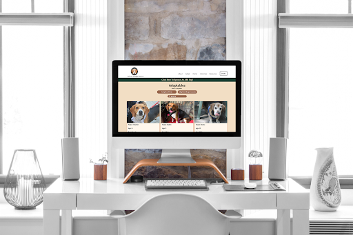
The Atlanta Beagle Rescue: Website Re-design
Brief:
A complete website redesign for The Atlanta Beagle Rescue; a 501(c)3 organization with volunteers who help save and rehome Beagles and Beagle-mixes in the metro Atlanta area.
Client:
For this project we had two clients; the first was The Atlanta Beagle Rescue and the other was the users who engage with their organization online. Their existing website was not functional and they were doing outreach, community updates, and finding adopters through their Facebook page. While they did want a way to better display their available beagles and engage with their community, they did not want a lot of added features due to all of the staff being volunteers.
The Original ABR Landing Page
Research & Analysis
The Solution:
To create an online space that can make it easier for users to find their future pets and create a community around those with the same love and vision as the Atlanta Beagle Rescue.
My Role:
UX Researcher + UI Designer
Competitor Analysis
The Atlanta Beagle Rescue has strong competition from:
The Georgia Beagle Rescue
The Beagle Freedom Project
The Atlanta Humane Society
These competitors have websites that seem to be functional.
Client Interview
After interviewing out clients on what their pain points and needs were we discovered three main opportunities:
Heuristic Evaluation
This evaluation is a bit misleading based on the color grades. Since the landing page was not functional, green represents:
elements that were present on the page
elements that were passable on the most basic level for a webpage
ABR did not want a lot of added features to their website since their entire team, including their website manager, are volunteers.
The Atlanta Beagle Rescue struggles with finding consistent fosters and donors for their organization
User Interviews
User Surveys
Q:
What are some of the reasons you decided to adopt?
A:
“There are so many babies that need homes, and I had the space, the means, and the need for a companion.”
The lack of organization that shelters and rescues had on their website that lead to a tricky adoption process
Client Facebook Analytics
We could make a website for ABR that makes their non-profit look more reputable to potential volunteers, donors, and adopters.
When discussing pet adoption websites, users said:
“Pictures are important for me and descriptions of the dog and their temperament.”
“ [It’s] nice if they have a behavioral descriptor of the dog, their breed, age, size, etc…”
Most people we surveyed have adopted or were heavily considering adopting a dog in the near future.
We interviewed 6 people 1:1 and received 23 survey responses. Two things that users felt hindered their adoption experience were:
Finding reputable places to find dogs. Users complained that they were often lied to about the breed, temperament, and health condition of the dog while they were going through the adoption process
Our initial theories about who our persona was were proven when ABR allowed us to take a look at their pages Facebook Analytics.
User Persona
Due to our research, we were able to figure out who our users were and build them into one persona.
Most of the people who visit their Facebook page were women between the ages of 45 & 54.
Definition
Affinity Diagrams
From our research and client interviews, we decided that the site didn’t need frills, but needed to be a place where the adoption process could be streamlined and the dogs easily showcased.
Ideation
Mobile Wireframes & Tests
I Like, I Wish, What If…
User Feedback
Overall, users really liked the experience, but felt the button formats, visual hierarchy, and alignment were not good UI
Style Guides
We wanted to stay true to The Atlanta Beagle Rescue’s original logo. We extracted the colors from their beagle logo and used those colors to set the tone for the app design. We also wanted to use rounded typography and buttons to show the the playful nature of these beagles.
Version 1
Users liked the fact that they had to scroll to the very bottom of the instructions text in order to fill out an application. They realize it’s important information to read.
High-Fidelity Mobile App
Atlanta Beagle Rescue Mobile Prototype Walk-Through
High-Fidelity Desktop Prototype
Initial Sketches
Card Sorting
Site Map & Task Flow
This project was super rewarding and the client was pleased with the work when we presented it.
Our proposed version of the ABR website is accessible, credible, and easier for beagle lovers to find their perfect furbaby
The work is not currently implemented on their website and they mentioned it was because they could not find a reliable person to code their website.
Prioritization Matrix
Prototyping, Iteration, & User Testing
Desktop Wireframes & Tests
Adoptable Dog Page (on Desktop)
Final Thoughts
Users thought we could have done a better job highlighting the adoptable dogs, so we put more clear boundaries around each dog and added font weight
Version 2
High-Fidelity Prototypes
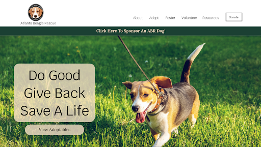
Atlanta Beagle Rescue Landing Page (on Laptop)
Thank you for reading!
Other Case Studies
The Wander Woman App
This is app was built for women who travel by women who travel.
MP•AR: A New App Feature
Climbers needed a 21st century way to climb. We provided them with an Augmented Reality experience they raved about.


